

Summer project for HCI master's program at University College Dublin.


User researcher, Prototyper, UX designer, Project Coordinator
Figma, GoogleDrive, Google Forms, Zoom
Numa Fathima, Kishitij Motke, Parv Dubey, Anneli Nurmi
May 2025 - August 2025
Our project centred on enhancing the Balancing Stress program, a crucial national resource aimed at helping individuals manage stress through accessible and practical online sessions. Recognising that mental well being is both a private and public health concern, we set out to understand how users engage with the platform and identify challenges they may face along their journey.
From the outset, our team engaged in extensive brainstorming and multiple ideation sessions to explore potential directions for improvement. We began with a thorough review of relevant background literature to ground our work in existing research and best practices. To better understand the current landscape, we conducted a competitive analysis and evaluated the usability of the existing website. Central to our approach was active user research, including co design workshops with members of the National Patient Panel. These workshops provided valuable insight into real user experiences and needs. Complementing this, we gathered feedback through surveys and data collection exercises to further inform our design decisions.
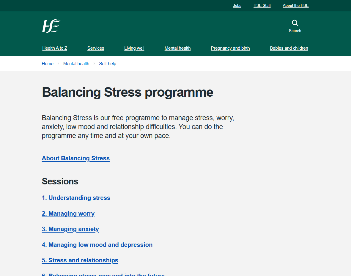
Balancing Stress is a free, self-directed online program developed by the Health Service Executive (HSE) to support individuals in managing stress, worry, anxiety, low mood, and relationship difficulties.
The program consists of six video sessions, each lasting approximately 35 minutes. These sessions cover key topics including understanding stress, managing worry and anxiety, coping with low mood and depression, navigating stress within relationships, and strategies for maintaining balance now and in the future. The sessions are designed to be watched in sequence over several weeks, giving participants time to practise the strategies introduced and gain the most benefit.
One of the key features of Balancing Stress is that it requires no registration, allowing users to access the videos anytime and at their own pace. Alongside the videos, the program includes practical exercises to help users apply the techniques in real-life situations, supporting ongoing stress management (Health Service Executive, n.d.).
Health Service Executive. (n.d.). Balancing Stress programme. https://www2.hse.ie/mental-health/self-help/balancing-stress/about/
How can we help people stay engaged with the Balancing Stress platform by making it easier to use,more personal, and more useful while still keeping it accessible for everyone?
Understand the needs of our partners, the domain, and the Balancing Stress program.
Engage with real users to understand their pain-points
Generate ideas solve user pain-points without compromising the needs of our partners
Utilise research to create a mockups and prototypes to solve user pain points
Analyze how prototypes are used by potential users.
Understand the needs of our partners, the domain, and the Balancing Stress program.
Engage with real users to understand their pain-points
Generate ideas solve user pain-points without compromising the needs of our partners
Validate research, ideas, and designs with real users.
Utilise research to create a mockups and prototypes to solve user pain points
Analyze how prototypes are used by potential users.
In order to find and analyse the literature, we came up with these research questions inspired by our design challenge:
Henson, P., David, G., Albright, K., & Torous, J. (2022). Deriving a practical framework for the evaluation of health apps. The Lancet Digital Health, 4(2), e57–e66. https://doi.org/10.1016/S2589-7500(21)00249-0
Kelders, S. M., Kok, R. N., Ossebaard, H. C., & Van Gemert-Pijnen, J. E. (2012). Persuasive system design does matter: A systematic review of adherence to web-based interventions. Journal of Medical Internet Research, 14(6), e152. https://doi.org/10.2196/jmir.2104
Lattie, E. G., Adkins, E. C., Winquist, N., Stiles-Shields, C., Wafford, Q. E., & Graham, A. K. (2019). Digital mental health interventions for depression, anxiety, and enhancement of psychological well-being among college students: Systematic review. Journal of Medical Internet Research, 21(7), e12869. https://doi.org/10.2196/12869
Ropero, J., Denecke, K., Rivera, O., & Gabarron, E. (2023). Personalized digital solutions for mental health. Studies in Health Technology and Informatics, 309. https://doi.org/10.3233/SHTI230797
Smith, K. A., Ward, T., Lambe, S., Ostinelli, E. G., Blease, C., Gant, T., Gold, S. M., Holmes, E. A., Paccoud, I., Vinnikova, A., Klucken, J., Uhlhaas, P. J., Garcia Sanchez, C., Haining, K., Böge, K., Lahutina, S., Tomelleri, L., Ryan, S., Torous, J., & Cipriani, A. (2025). Engagement and attrition in digital mental health: Current challenges and potential solutions. npj Digital Medicine. Advance online publication. https://doi.org/10.1038/s41746-025-01778-w
Torous, J., Jän Myrick, K., Rauseo-Ricupero, N., & Firth, J. (2020). Digital Mental Health and COVID-19: Using Technology Today to Accelerate the Curve on Access and Quality Tomorrow. JMIR Mental Health, 7(3), e18848. https://doi.org/10.2196/18848
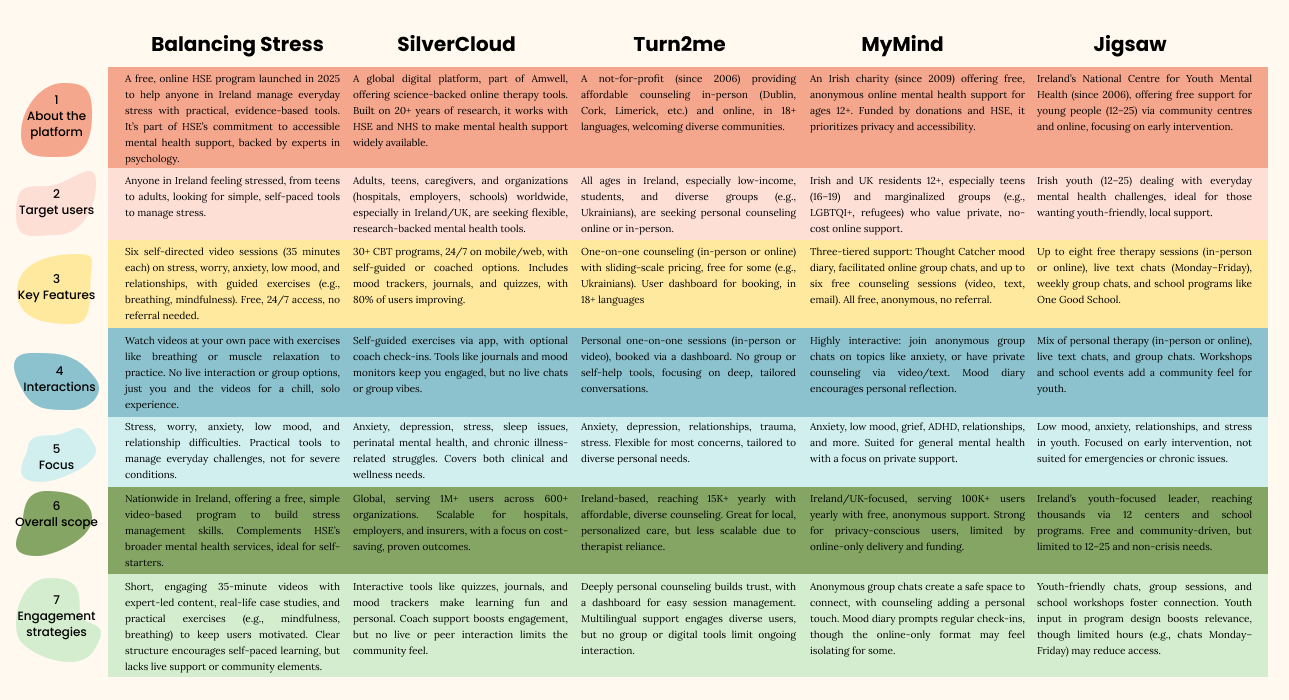
We’ve conducted a competitive analysis of four leading Irish online mental health platforms: SilverCloud by Amwell, Turn2Me, MyMind, and Jigsaw. By examining their engagement strategies, target users, overall scope, mental health focus, and key features, we aim to identify what makes these platforms resonate with users and how Balancing Stress can borrow their best ideas.
To understand how users experience the Balancing Stress tool, we carried out a usability review using Nielsen’s (1994) usability heuristics. This helped us spot areas where the platform could be clearer, more engaging, or easier to use. Since it is a public mental health resource, we also considered accessibility standards from the Web Content Accessibility Guidelines to ensure it works well for everyone. Our goal was to identify what is working and what could be improved to make the tool more helpful and user-friendly. For reference, 0 out of 5 means there is no issue. A 5 out of 5 means the problem is critical and should be fixed immediately.
Nielsen, J. (1994). 10 usability heuristics for user interface design. Nielsen Norman Group. https://www.nngroup.com/articles/ten-usability-heuristics/
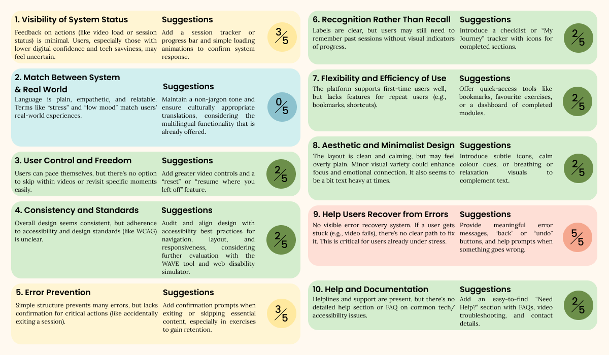
The average severity score of 2.3 out of 5 indicates several moderate usability issues across the HSE Balancing Stress website. While the platform offers strong content and a supportive tone, issues like limited progress tracking and a lack of interactivity slightly hinder the overall experience. The most critical concern lies in the absence of effective error recovery, as users are left without clear guidance or support when something goes wrong. It is essential to ensure users feel safe, confident, and supported throughout their journey.
In the Empathise phase, we shifted from foundational research to a deeper exploration of real user needs and behaviours. Starting with an initial user journey map and research plan, we adapted our approach based on emerging insights. Through surveys, poster iterations, and workshops, we gathered both qualitative and quantitative data. This was analysed using thematic analysis and translated into key findings, updated user journeys, and relatable user scenarios that shaped our ideation process.
We aimed to build empathy for potential users by reaching out to them in a participatory design approach using surveys. By engaging users in this way, they can influence decisions related to the system being designed or fixed. The data we collected from potential users played a crucial role in shaping our final decisions for this project. Including users in research for digital products is necessary because users could potentially perceive and use the designed products in an unexpected way.
We hoped to use our survey to gain knowledge from the general public of Ireland to learn how they started using Balancing Stress and what their experience was like using the program. However, Balancing Stress is a new program, and we recognized that finding the actual program users in Ireland would be rare. Therefore, we also included a section about general DMHI to learn what has been successful for other programs through the perspective of actual users to apply that generalized information to our research.
The survey was created on Google Forms and consisted of two separate sections: one for Balancing Stress and the other for general DMHI. Each section had roughly 20 questions that ranged from asking about the challenges of using DMHI to specifically when and why participants stopped using Balancing Stress.
We distributed the survey in two ways as well. Our first distribution was through online channels, through WhatsApp, Facebook, and more. Our second distribution was through printed posters put up around higher education campuses in Dublin.
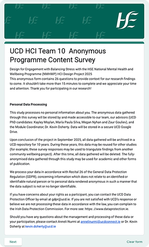
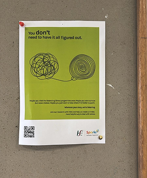
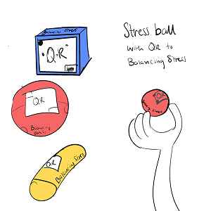
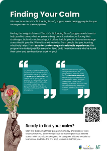
As part of our revised approach, we launched a small-scale poster campaign across the UCD campus to raise awareness of the Balancing Stress program and invite users to share their impressions via a tracked QR code. This effort served a dual purpose: to inspire early-stage design ideas through real-world input, and to evaluate the long-term feasibility of posters as a low-barrier outreach and feedback method. By shifting away from GP-based distribution, this campus-focused approach aligned with partner feedback while still supporting our user-centred research goals.

We developed our survey to have two parts. One part aimed to get information about the general use of DMHI, and the other part was about Balancing Stress. Because Balancing Stress is a new program, our survey data was 100% about the general usage of DMHI. None of our participants had heard of Balancing Stress before the survey. With our survey results, we were able to inform our idea generation and final suggestion for our partners regarding improving engagement with the Balancing Stress program.

We met with both our partners in early July 2025 to further discuss how we planned to run the workshop. Together we planned to conduct two online workshops with the goal of finding the pain points participants had with Balancing Stress, showing our ideas, and brainstorming more ideas with participants to learn what they expected to improve in the program. We also clarified how Balancing Stress was meant to be used. Sessions are meant to be watched and listened to however users want to. For example, they just listen to it as they walk. This meant that there was a possibility of alternative forms of engagement through audio or text that we could brainstorm for.

Large-scale updates would require extensive approval, development resources, and long-term maintenance, which were outside the project’s scope.

Altering sessions could compromise the therapeutic integrity and consistency of the program. As such, our design interventions focused on supporting engagement around the sessions, rather than within them.

Accessibility guidelines required strict compliance to ensure the platform is usable by all. This limited our ability to alter colours, layouts, and interactive features, ensuring we maintained clear, consistent, and inclusive design throughout.

Strict privacy requirements and limited data access meant we had to carefully design studies that protected user confidentiality while still gathering meaningful insights.
Our goal was to create a solution that would both improve engagement for users and translate interactions with that engagement tool into data for the HSE team. We discussed and reviewed our past meeting notes to have a united understanding of what problems our partners were facing. The HSE team lacked a way to test assumptions from the analytical data they received. They wanted to know why users only stay for three seconds and whether or not they will come back in the future. Therefore, our main challenge became:
How can we create a tool that is simple for our partners to implement, enhances user engagement, and translates those interactions into meaningful data for our partners?
We spent a week individually looking for inspiration for approaching the problem from different angles, then shared and discussed our final ideas as a team. We kept additional questions in mind as we discussed our ideas:
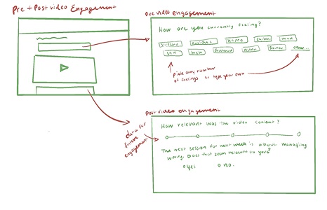
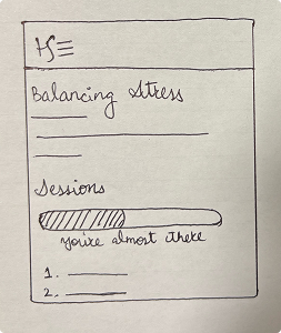
Some of our teammates approached the problem statement and questions by looking at what could be done for the benefit of our partners. Others looked towards existing features that successfully promoted engagement in other systems. Some team members imagined beyond the restrictions we learned in the previous partner meeting by also solving problems found in past research. The following images are some ideas produced from these different perspectives.

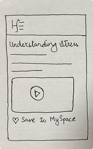
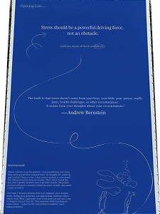
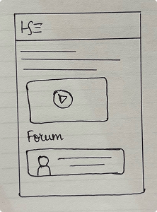
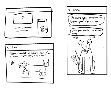
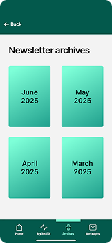
The majority of the participants appreciated the familiarity with the newsletter as a way to connect with other patients’ stories, even participants who had previously expressed difficulties with technology. The next steps to improve this design involved creating a layout that is both accessible and visually appealing.
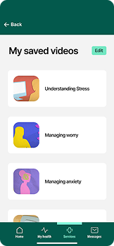
The majority of the participants also believed that the saved videos would be very useful for organising and revisiting helpful content, especially without needing a login. However, there was a concern that the heart icon was too stereotypical or "off-putting", and participants suggested alternatives like a tick or star for clarity and comfort.
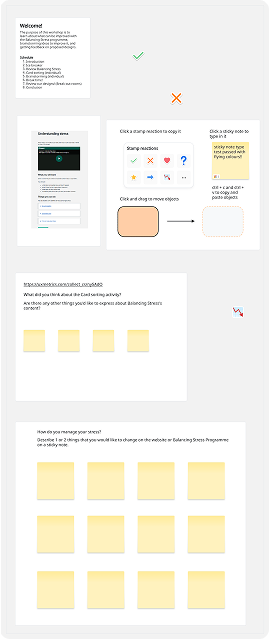
While we had a successful first workshop, there are quite a few things we learned that we should do differently in order to have more success. What limited us during this first workshop was that we did not know who our participants were and what activities they would be comfortable participating in. If we had known that they would not want to use new software, we would have designed another activity that could be engaging but effective in getting the information we wanted to achieve.
We chose to conduct a thematic analysis of the results from our online workshops to more effectively explore our research questions. While some findings may not directly address each research question in full, they contribute valuable insights to broader themes. Identifying recurring patterns across our data helped us form a cohesive picture of user needs and expectations, rather than treating each response in isolation.
Participants had varied preferences for stress management techniques. For example, P1 disliked mindfulness exercises, preferring self-reflection, while P2 found mindfulness very helpful. P3 noted that mindfulness is often a "common sense" practice that people already do, suggesting that the program’s framing of mindfulness may feel patronising to some users.
P2 informed us that the structure of the programed content was well formatted. The variety of the exercises also appealed to many of the participants, encouraging a positive outlook for the program’s future.
Participants questioned how the program would reach diverse audiences, especially those unaware of it or not engaged with mental health services. Suggestions to improve awareness included partnering with places people frequent, like general practitioners and clinics and reaching out to inform new generations of healthcare and social workers.
Participants appreciated content that included relatable examples but wanted more authentic stories from peers who have navigated stress or mental health issues. Particularly, participants emphasised the need for the program to include the voices of individuals with lived experience of mental health challenges instead of only the voices of the experts. P2 noted, "Our voice wasn’t heard in that video,” suggesting that the current content, driven by professional psychologists, lacks relatability.
Participants, particularly older users (P1 and P2), expressed frustration with the digital interface of the Balancing Stress program, citing difficulties in navigating apps and websites. For example, P1 stated, "I do not understand it. I cannot use it," highlighting a steep learning curve for some users. Concerns were raised about accessibility for individuals without internet access or those using basic mobile phones. A concern for how the content could effectively fit within a patient’s time was also brought up.
In order to refine our designs, we took our feedback and lo-fi design ideas and further developed them in Figma and Canva.
For two of our high-fidelity designs, we replicated existing HSE platforms in Figma, specifically the Balancing Stress web pages and the HSE app. Both high-fidelity designs included interactive components, such as drop-down menus, page links, buttons, and scrolling functionality. Our goal was to demonstrate how our ideas could seamlessly fit into the existing system without requiring major changes, which was an important consideration throughout the entire project.
We created the newsletter using Canva, drawing inspiration from the Balancing Stress program assets provided by the HSE team to align it with the overall campaign. The content was designed to be relatable and to encourage long-term engagement, based on insights from our previous workshop. Additionally, we incorporated fonts, colours, and visual styles from the partner pack provided by the HSE team to ensure our design remained consistent and aligned with HSE design standards.
.png)
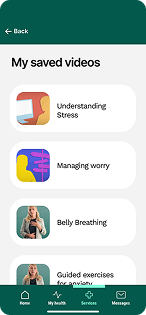
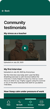
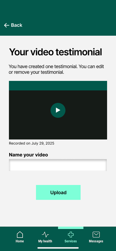
Participants suggested that the app should include the option to share video testimonials, particularly as a way for users to tell their stories anonymously without signing in through MyGov ID. Introducing this feature would allow the Balancing Stress team to expand their collection of user stories and testimonials, helping to create a more personalized experience. This idea was first discussed during the first workshop in early July 2025. Participants also proposed the addition of SMS reminders within the app, enabling users to customise when they receive reminders, how they are delivered, and how often they appear.
Participants expressed a strong interest in hearing not only the stories of fellow service users and patients but also the experiences of medical staff working in high-stress environments. They recognised the importance of supporting the mental well-being of healthcare workers and encouraged them to use the app as a platform to share their stories.
In addition to adding the existing Balancing Stress program to the new HSE app sooner to create an accessible experience for the general public, we also propose the addition of a few features to enhance the engagement of the program.
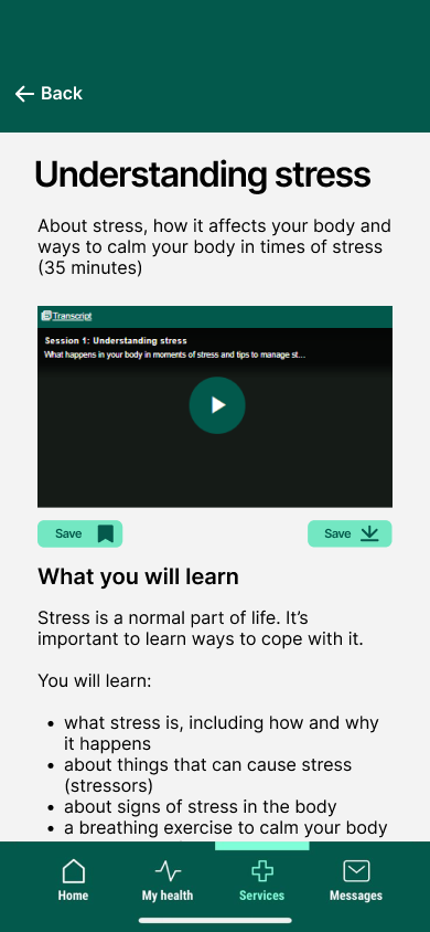
The goal of the saved video content is to provide users with the opportunity to access content faster.
Community testimonials allow users to share their stories in different formats: text, audio, or video.
The goal of the newsletter is to provide a more personalised experience with the Balancing Stress program. The newsletter could potentially be geared towards the older generations (aged 60 and above) of Ireland.
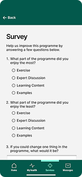
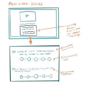
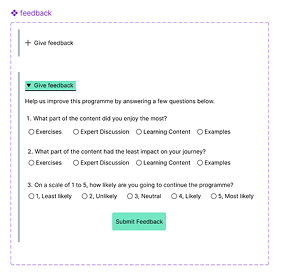
The goal of the survey is to provide specific data to the HSE team in the least amount of questions that would take up a user’s time.
If this embedded prototype does not work, use this link to access the prototype.
Balancing Stress Figma PrototypeThis project was similar to previous academic projects I have completed, but it was my first experience working with both a team and clients at the same time. In the past, my team's experiences were solely within an academic context. Since we were committed to a real product, this team project was quite stressful as we aimed to complete tasks accurately and on time. While we were students learning and applying the skills and methods we had acquired during our master’s program, it often felt as though we were expected to act as professional user experience designers who needed to deliver flawless results without making mistakes. Balancing these two distinct roles proved to be a significant challenge.
Overall, my experience was positive. I had the opportunity to work on a complex problem and enhance my skills while relearning how to design a product from scratch. I take pride in having been involved in most aspects of the project, from communicating with our partners to contributing to the completion of our final group portfolio designs.
Preparing for the workshops was quite stressful, particularly when submitting a new change to our low-risk ethics submission. However, I believe I handled the sudden changes and challenges during the workshops well enough to maintain confidence in my ability to host future events for research. I am also confident that we managed the data from our workshops and surveys responsibly by anonymising it and securely uploading it to Google Drive folders