Graphic design and branding project for a modern-day soda shop.
Tools
Figma, Canva, Pexels, Pinterest
Project Overview
The goal of this project was to design and develop a brand for a modern-day soda shop. The most popular sodas in today's time have added ingredients and sugars that are inherently delicious yet unhealthy. Homemade sodas with natural ingredients can be a beneficial alternative of satisfying one's cravings without extra ingredients. As someone who is not fond of cocktail lounges or bars, I would love to go to a soda shop similar to the soda fountains of the 20th century to socialize and try new types of drinks without worrying about how it would affect me later. Thus, I am creating the brand design for my dream soda shop: Soda Social.
Research
Coca-cola
- Purpose is to "refresh the world and make a difference" (About Us).
- Red is the main color associated with Coca-cola.
- High social impact in communities around the world with clean marketing design.
Pepsi
- Pepsi aims to be the global leader in "beverages and convenient food" (About Us | Contact Pepsi).
- Blue is the main color associated with the Pepsi brand along with its logo.
- Aims to compete with Coca-cola in terms of taste, nutrition, and sustainability.
Olipop
- Prebiotic soda that is healthy thanks to added fibers and less sugar (OLIPOP FAQs)
- Main color seems to be a light beige.
- Colors and logo change according to flavors on the cans.
Brand Goals
Soda Social
- Mission: Build a positive environment with good vibes and delicious drinks.
- Vision: Foster friendships, create memories, support community.
- Personality: Friendly, cozy, fun, innovative, family, welcoming, cheery
Logo
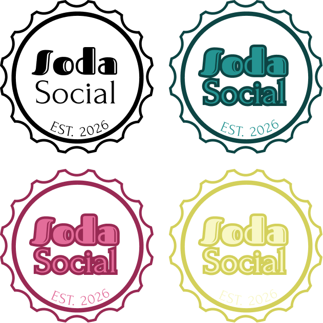
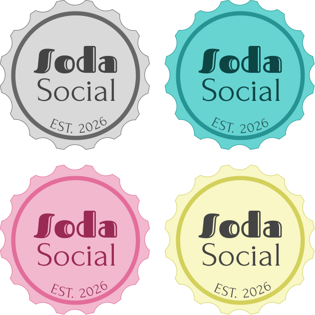
- Designed to look like a bottle cap.
- Main design is black outline which is used on the website, social media, and menus.
- Second group is most used for bottle labels and Carbonation Club fliers.
- Third group would most likely be used for evening and night events, mimicking neon signs lighting up the night.
- Avoid using the fourth group of logos.
Logo with Tagline
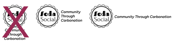
The tagline, Community Through Carbonation, portrays the welcoming atmosphere Soda Social strives to create. It should only be used to the side of the logo.
Colors and Typography
Colors
.png)
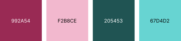
- Colors based off soda shops and ice cream shops from the 1940s and 50s that had pink and teal colors.
- Yellow added as a tertiary color to provide balance as the triad of colors mimic the primary colors red, blue and yellow.
- Colors are bright and inviting yet also muted enough to not overwhelm customers.
Typography
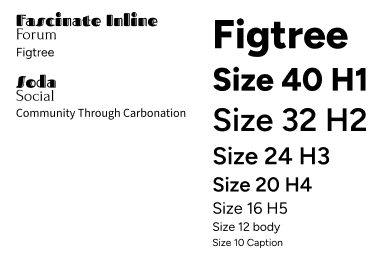
- Fascinate Inline used for the Soda in Soda Social. While it mimics font that could be used for a sport like F1 or racing,
- Forum used for the Social in Soda Social because it has a slight serif. It is a very classy font, which can be associated with the social clubs in the 18th, 19th, and early 20th centuries.
- Figtree is a sans serif font that allows for a variety of styles including extra bold and italicized. It is used in all the content for the mockups as headings and body text.
Mockups
Printed
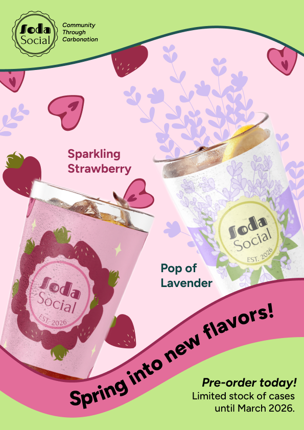
Poster advertising new flavors.
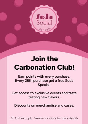
A6 size advertisement for rewards program called the Carbonation Club.
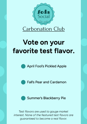
A6 size document for rewards members to vote on test flavors.
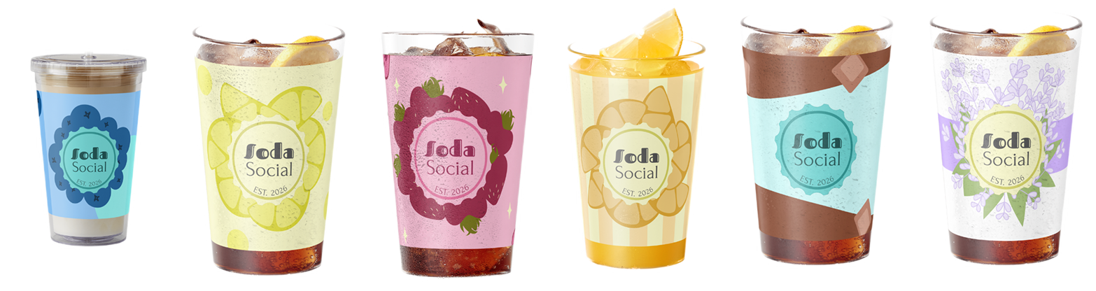
Printed label for glass soda bottles.

Digital
Instagram post for new spring flavors.

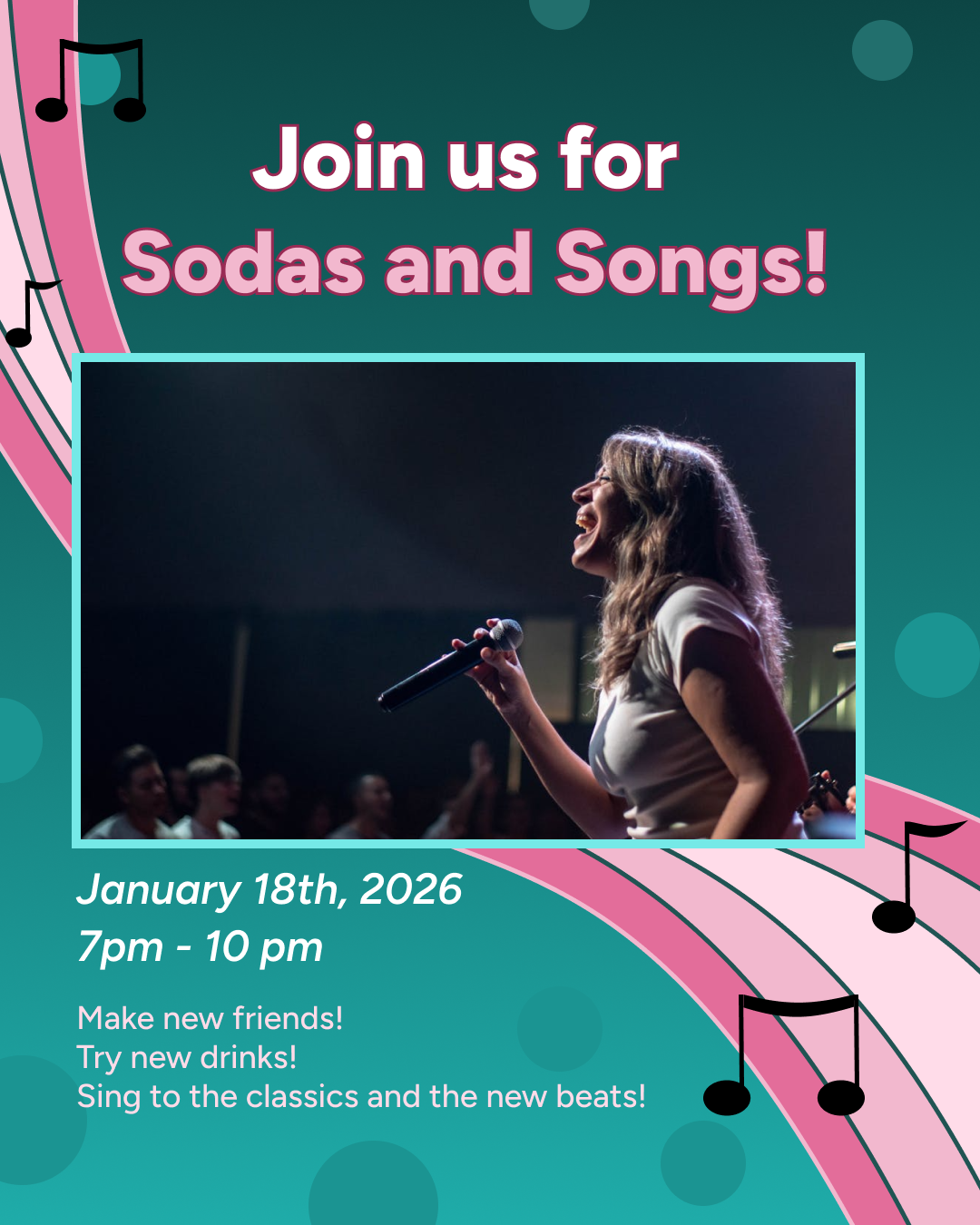
Instagram advertisement for a karaoke night at a Soda Social shop.